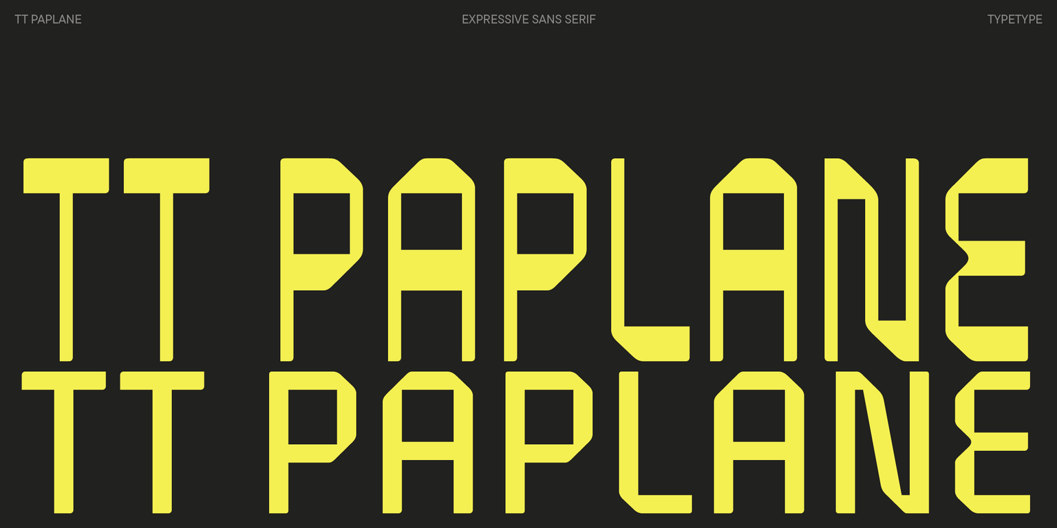
Sans serif fonts have become a cornerstone of modern typography, known for their clean lines, readability, and versatile design. As we approach 2024, new trends in sans serif fonts continue to emerge, offering fresh and innovative ways to enhance your designs. Whether you’re working on a logo, website, or print project, upgrading your typography with the right sans serif font can make a significant difference. In this article, we’ll explore some of the trendiest sans serif fonts that you should consider incorporating into your design toolkit.
1. Geometric Sans Serifs for Minimalist Design
Geometric sans serif fonts are perfect for those who love a minimalist aesthetic. These fonts are characterized by their precise, geometric shapes and are ideal for creating modern, clean designs. Fonts like TT Commons Pro and Futura are classic examples of this style. They are often used in branding, logos, and digital interfaces due to their sleek and timeless appeal. Geometric sans serifs offer both simplicity and sophistication, making them a versatile choice for various projects.
2. Humanist Sans Serifs for a More Organic Feel
Humanist sans serif fonts are inspired by traditional calligraphy, offering a more organic and warm feel compared to their geometric counterparts. These fonts are excellent for projects that require a touch of friendliness and approachability. Examples include Gill Sans and TT Fellows. The slightly varied line widths and subtle curves make these fonts ideal for body text, user interfaces, and anywhere you need a balance between professionalism and warmth.
3. Display Sans Serifs for Bold Headlines
When you need to make a statement, display sans serif fonts are the way to go. These fonts are designed specifically for headlines, posters, and other large-format applications where impact is essential. TT Rounds Neue and TT Travels Next are standout examples of display sans serifs that offer a bold and expressive look. These fonts are not just functional but also visually striking, making them perfect for grabbing attention in both print and digital media.
4. Neo-Grotesque Sans Serifs for Versatile Applications
Neo-grotesque sans serifs are known for their straightforward and neutral design, making them incredibly versatile. Fonts like Helvetica and Arial fall into this category and are widely used across different industries. In 2024, the trend continues with fonts like TT Interphases Pro, which is perfect for digital interfaces due to its readability and uniform appearance even at small sizes. Neo-grotesque fonts are a reliable choice when you need a font that works well in a variety of contexts without drawing too much attention to itself.
5. Rounded Sans Serifs for a Friendly Touch
Rounded sans serif fonts bring a touch of softness and friendliness to your designs. These fonts are especially popular in branding for products aimed at children, eco-friendly goods, or anything that benefits from a warm, approachable look. Fonts like Wandorf and TT Rounds Neue are great examples of rounded sans serifs that combine modern aesthetics with a gentle touch. These fonts work well in both digital and print formats, adding a layer of personality to your projects.
6. Experimental Sans Serifs for Unique Designs
For designers looking to push the boundaries, experimental sans serif fonts offer a way to break free from traditional typography rules. These fonts often feature unusual shapes, distorted proportions, or quirky details that make them stand out. Stumblebum and Karviet are examples of experimental sans serifs that bring a unique character to any design. These fonts are ideal for projects where creativity and originality are paramount, such as in artistic branding or avant-garde editorial layouts.
7. Sans Serifs with Ligatures for a Stylish Edge
Ligatures are special characters that combine two or more letters into a single glyph, adding a stylish flair to your text. Sans serif fonts with built-in ligatures are increasingly popular in modern design for their ability to create smooth, flowing text that feels both contemporary and elegant. Hundred Ligatture and Peosa are examples of sans serifs that include extensive ligature options, perfect for creating distinctive logos, headlines, and social media graphics.
Conclusion
Incorporating trendy sans serif fonts into your typography can dramatically elevate your design work, offering both elegance and readability. Whether you’re aiming for a minimalist look with geometric fonts, adding warmth with humanist styles, or making a bold statement with display sans serifs, the right font can make all the difference. As design trends continue to evolve in 2024, experimenting with these various sans serif styles will help you stay ahead of the curve and ensure your projects stand out.
For more inspiration and to explore a wide range of sans serif fonts, visit https://typetype.org/. This resource offers a comprehensive selection of fonts to suit any design need, from classic to contemporary. Upgrading your typography with the right sans serif font not only enhances your design but also ensures your work remains fresh and relevant in the ever-changing world of design.
